Why does your baby look sunburned in half the photos on your phone, and perfectly fine in the rest? Nine times out of ten the answer has nothing to do with your camera. It is the red cushion just out of frame, or the bright blanket, or the wall you happened to be standing beside. Baby photo colors are a technical decision more than a decorative one, because everything near a newborn ends up on their face.
This post covers why newborn skin behaves the way it does in the first weeks, the three palettes that consistently work, the two that consistently fight you, and how to dress a whole family without anyone looking like a uniformed choir.
Why does newborn skin photograph red and blotchy?
Fresh newborn skin is not the smooth pink of stock photography. In the first two weeks it is commonly red or mottled, often peeling across the hands and ankles, sometimes patchy with baby acne, sometimes faintly yellow. All of it is normal, and all of it passes. None of it needs fixing.
But a camera reads red as red. Whatever redness is present gets recorded, and then anything else red or orange in the scene adds to it. That is the whole reason professional newborn photographers own approximately one blanket color, in five shades of oatmeal. They are not being minimalist for its own sake. They are refusing to add anything to skin that is already at the top of its range.
For the first fortnight, assume every color in the room is being painted onto your baby's face. Choose the room, the blanket and your own shirt accordingly, and half the editing disappears before you start.
Which baby photo colors work best?
Warm neutrals
Cream, oatmeal, sand, camel, warm white. The default for a reason. Warm neutrals sit close to skin tone without competing, so the baby stays the brightest and most interesting thing in the frame. They also age well, since a portrait in cream will still look right on a wall in ten years, which is more than can be said for a photo built around a trend color.
Cool grays and dusty blue
Slate, dove gray, soft denim, muted sage at the edge of the family. These pull very slightly against a red-toned face and calm it down. Cool grays print especially well, holding their tone rather than drifting warm the way beige sometimes does on cheaper paper. They suit modern nurseries and sit well against wood.
Why do muted pinks work when bright pinks do not?
Muted pinks and mauve
Dusty rose, blush, clay pink, mauve. The trick is desaturation. A muted pink gives gentle contrast against skin, while a saturated hot pink does the opposite, throwing pink light straight back onto the cheeks. If a color looks slightly dusty or grayed in the shop, it will photograph beautifully. (Shop lighting flatters saturation, so carry the fabric over to a window before you decide.)
Mauve and clay are the safer end of the family, since both carry enough gray in them to stay quiet next to skin. Blush is the one to watch, because a good deal of the fabric sold as blush turns out to be closer to salmon once daylight hits it, and salmon on a wrap gives you a salmon baby.
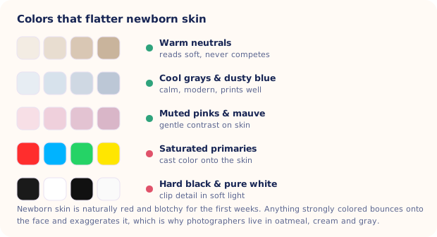
The top three rows in the chart are your working palette. Practically every newborn portrait you admire online was built from one of them, usually with a single accent from another.
The two palettes that fight you
- Saturated primaries. Fire-engine red, electric blue, bright green, taxi yellow. These do two bad things at once. They out-shout the baby, and they bounce their own color onto the skin, so a red blanket gives you a redder baby and a green one gives you a slightly ill-looking baby. Fixing that afterwards means pushing skin tones around until they look artificial.
- Hard black and pure white. Both clip in soft window light. Black loses all texture and turns into a flat hole in the frame; pure white blows out and takes the detail of a knit or a wrap with it. Charcoal instead of black, cream instead of white, and you keep the contrast without the loss.
Neither rule is absolute. A charcoal-and-cream setup can be stunning, and a single red accent in an otherwise neutral holiday scene works fine. The failure mode is filling the frame with them.
Color bounce is the part people miss
Light does not stop when it hits a surface. It picks up that surface's color and carries it onward, which is why a baby lying two feet from a terracotta wall photographs orange, and a baby on a lawn photographs green under the chin.
Four places to check before you shoot:
- The nearest wall. Strongly painted walls tint everything within a meter or so. Move the setup toward a neutral one.
- What you are wearing. If you hold your baby, your shirt is a light source. A bright top will color the face under the chin.
- The floor covering. Bold rugs bounce upward into the shadow side of the face.
- Nearby furniture. A red sofa just outside the frame still ends up in the photo.
Bounce cuts both ways. A white pillow or a sheet of foam board propped on the shadow side of your baby reflects clean, colorless light back in and softens the contrast. Pair that with the window-light setup in our newborn photography lighting guide and the color work is basically done in-camera.
How do you coordinate a family without matching?
Matching outfits date a photo faster than anything else in it. Coordinating means picking one palette and giving everyone a different job inside it.
| Who | Role in the frame | Example |
|---|---|---|
| Baby | Lightest tone, no pattern | Cream wrap or plain white sleeper |
| Parent holding baby | Mid-tone, plain, soft fabric | Oatmeal knit, dove gray tee |
| Second parent | Deepest tone for contrast | Charcoal or muted navy |
| Older sibling | The one accent | Dusty rose, sage, soft mustard |
| Everyone | Avoid | Logos, stripes, neon, bright white |
Lay every outfit on the bed together before anyone gets dressed. If one item jumps out at you on the duvet, it will jump out in the photo. There is more detail on fabric and fit in our newborn photoshoot outfits post, and the same palette logic applies to whatever you put behind everyone, covered in baby photo backdrop ideas.
Fixing color after the fact
Some color problems are correctable on your phone. Slight overall warmth comes out with a small temperature adjustment. Mixed lighting, where a window and a lamp are fighting, does not, and pushing saturation down to hide redness usually leaves everyone looking gray.
Rebuilding the scene entirely is the other route. Totti preserves your baby's real facial features and regenerates the backdrop, outfit, lighting and color styling around them, so a photo taken on a busy red rug can come back on a cream knit blanket in soft studio light. A before and after slider lets you compare the two side by side, and lighter touch-ups are covered in our baby photo editor guide.

A flattering palette, applied for you
50+ templates built around neutral, studio-tested color: Classic, Cozy, Outdoor and seasonal sets, with virtual outfits to match. Your baby's real features stay exactly as they are. Free to download on iPhone and iPad.
Get Totti on the App StoreKeep the palette boring and the baby stays interesting. Cream, gray, dusty pink, one accent, nothing neon within a meter of the frame. That single habit will improve your photos more this month than any lens you could buy.